documenting my website design journey
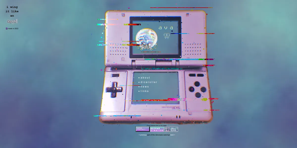
When I first made my own website, it was on Neocities. It was pretty barebones for a few months and development stalled. It featured an edited, glitchy looking Nintendo DS in the center where the screens served as a place for links and info. I made that graphic myself.
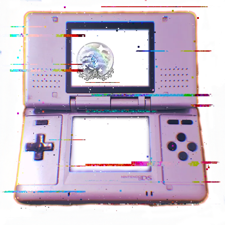
It was super hard for me back then to center it and make the text fit into it on most devices, but I mostly managed.
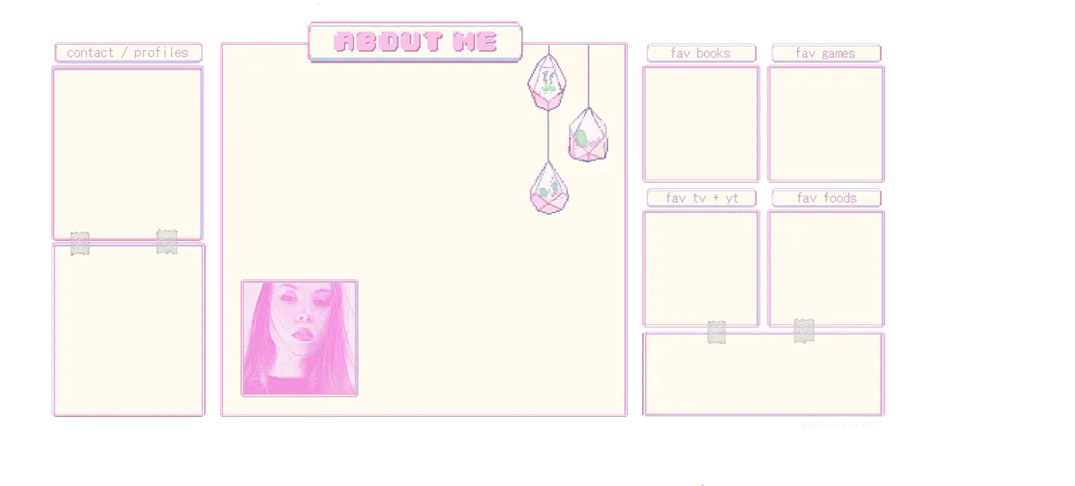
After I got over this challenge, I created an interests page. Different containers aligned text fitting to the background. I made the background myself in Aseprite.
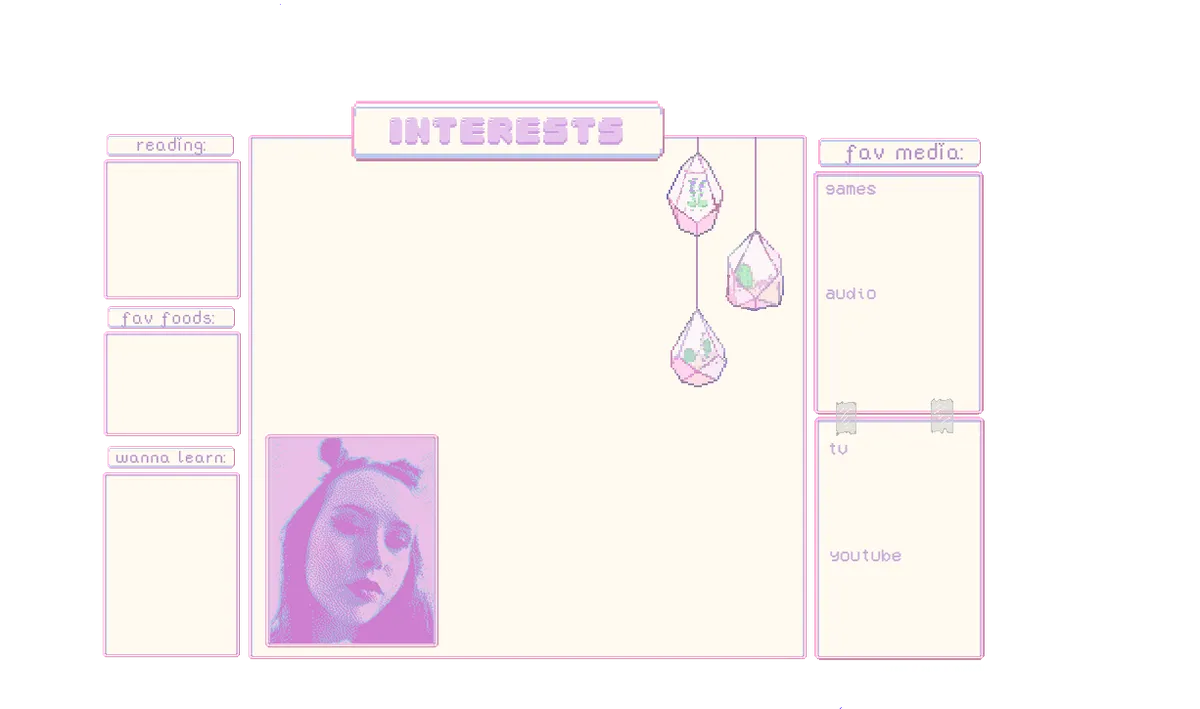
It wasn't big enough though, so I reworked it later:
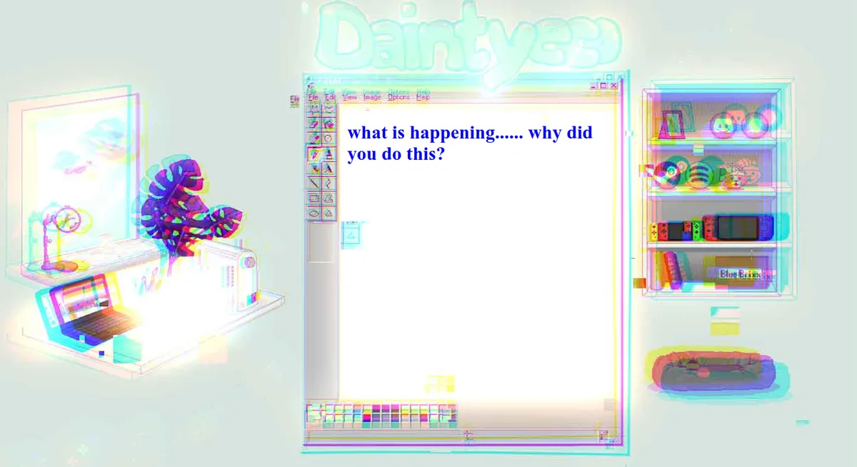
I also had a Desktop looking page with Paint, which I revived with minor changes here. Screenshot for easy viewing:
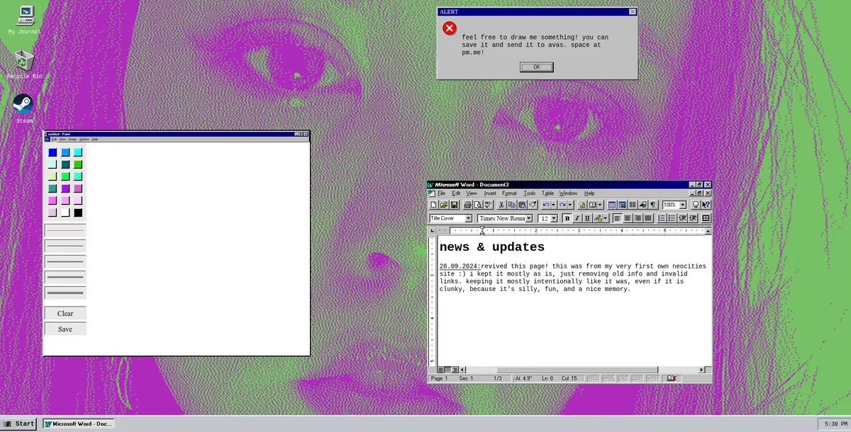
Back then, it featured my status, and an update log of the site.
Then I came across Mei's old website. I loved the window look it had, so I tried to make something by myself that has a window. I wanted a shelf that held icons to click on that would lead you to fitting pages. Steam icon for my Steam account, a Steam Deck for my Steam Deck modding page, a little Switch for my ACNH page, books for my blog and poetry and so on. The middle would have a modified Paint window to be a background for text. So I went to work in Aseprite and produced this:
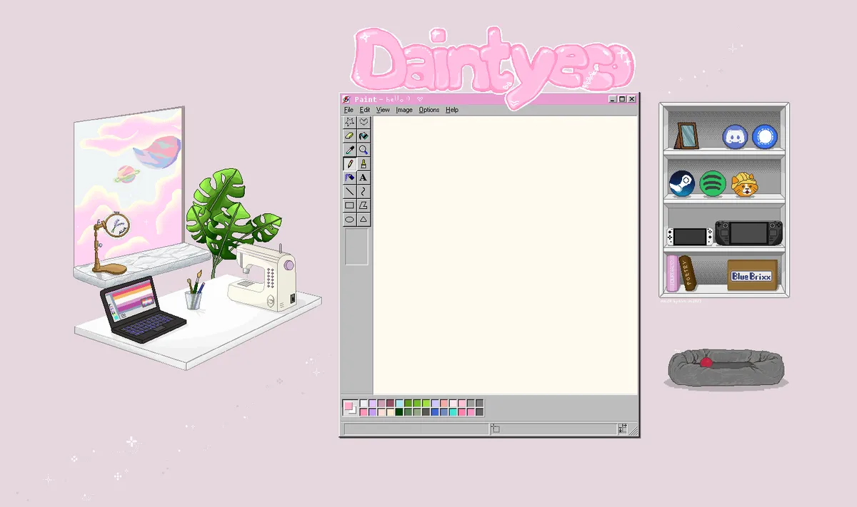
The sewing machine, laptop, embroidery hoop, dog bed, window and brushes were also clickable and led to sites documenting my sewing and embroidery projects, digital art, my dog's page and a site listing other sites I like.
There were stars in the background and in the window, blinking. I had to get creative with animating it because I didn't like the limited color palette GIF would give me. So instead, I exported all frames as PNG, and then used an APNG (Animated PNG) converter to put them all together. That would allow me the quality and colors I needed, but it's still animated. For clicking, I used HTML image mapping. It defines clickable areas and links on an image.
Everything included, it looked like this:
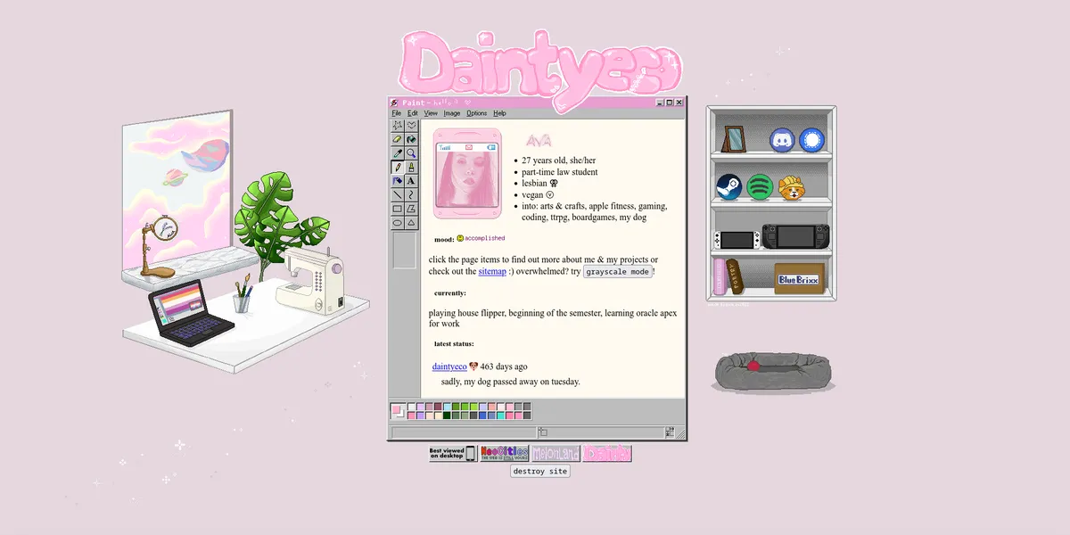
You notice I offered an option for grayscale. This made it so all elements would be gray, unless they are clickable; the clickable elements stayed colored. This way, I wanted to make interactable elements more noticeable. Clicking it made it look like this:
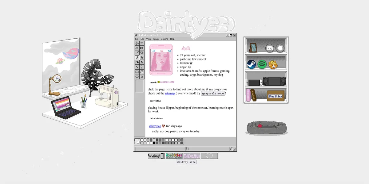
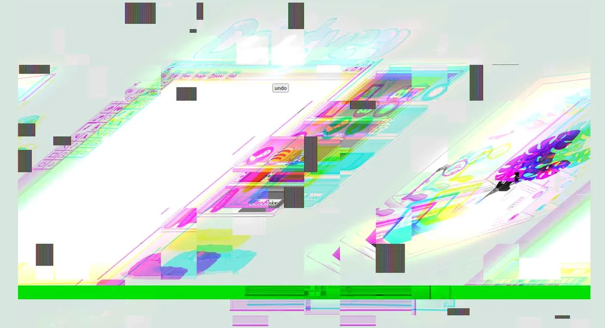
You also had the option to destroy the site. What that meant is that it would lead to a glitchy, distorted version of the website, slowly making it worse. Then you were presented a button to undo it and you could back to the normal site.
I want to do this again some time with my current site :)
If you know my current website design, you know this is very similar. The reason I changed it was that all my designs were focused on a horizontal big screen and didn't scale well. Also, when you first get into making websites like that, it's easy to let it explode - a page for this, a page for that. But it takes a lot of time to update them, change them, maybe rewrite the code of older pages when you've learned. It just got out of hand and I felt like I would spend too much time overhauling things all the time. I wanted a smaller, more lightweight site with only a handful of sites to keep updated, and combining a few, removing a few and overall consolidating it. So a smaller vertical design made sense that focuses on desk and window only.
The new site design was actually a higher resolution pixel art, and it took me over a 100 hours of meticulously placing pixels by hand, especially the clouds.
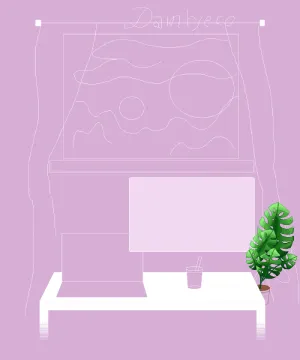
Here's the little sketch planning some while already mostly done with the leaves:
The final product, as you can currently see on my website, is this:
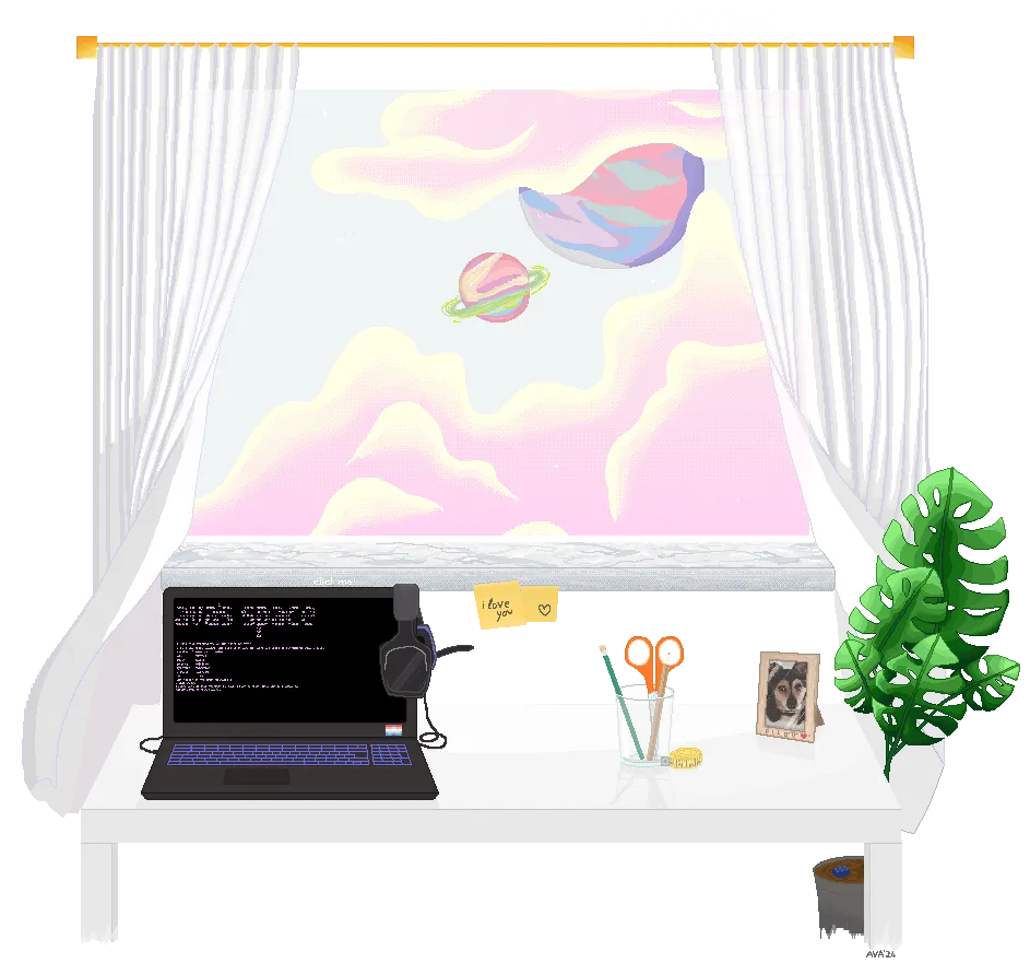
The original on my website is an apng as well, has animated elements and features an image map. Clicking on the laptop leads you to the terminal, same one that's linked in my garden.
So that's where we are. I itch for something more creative like that again, so we'll see what I come up with for my current site. Wanted to make a post like this forever, but it took quite a time to go through all my backups, unzip them, click through all kinds of folders and open the index files for original files and screenshots. Hope it inspires someone and also shows how things developed.
Published